01 — Context
A side studio for businesses that care about the details.
Alongside my role at Comcast, I run Sena, a small web design studio. I specialize in med spas and aesthetic clinics, but I’ll build for any business that cares about the details.
My clients are local business owners whose websites undersell them. The work is part UX, part business: understanding what an owner wants to present, and what their customers are actually looking for.
02 — Problem
My first pitch gave the work away.
My first approach was generous. For every site worth redesigning, I ran a heuristic evaluation, redesigned the site, and emailed the owner my findings with a live preview of the proposed changes.
It failed in two ways. It was time-consuming, with hours of work per prospect before any conversation. And owners would simply take my design guidance and implement it themselves.

Fig. 01
The pitch, before and after. A full custom redesign per prospect became one universal demo that opens a conversation.
03 — Research
Treating the pitch like a product.
I looked at my pitch the way I’d look at any product that wasn’t converting. The evaluation was doing its job: it showed owners I understood their business. The free redesign was the problem. It answered the very question I wanted them to hire me for.
So the job of the pitch changed: prove I can deliver, without delivering the work for free.
04 — Key decisions
Three choices that reshaped the pitch.
I kept what earned trust, cut what gave the work away, and rebuilt the demo around both people a website serves.
Decision 01
One universal demo instead of custom redesigns
Why
Custom redesigns took hours per prospect and handed over the finished answer, so prospects had no reason to hire me.
Tradeoff
A less personal first impression: the demo isn’t their brand, so the evaluation carries the personal part.
Decision 02
Keep the heuristic evaluation, change its job
Why
The evaluation is still how I show I understand a business. Paired with the demo, it starts a conversation instead of delivering a finished fix list.
Tradeoff
Each prospect still takes evaluation time, so I keep it focused on what matters most to their customers.
Decision 03
Design every section for two people
Why
The owner wants to present expertise and a premium feel; their customer wants to understand services, trust the team, see results and book. A section has to work for both.
Tradeoff
Some owner priorities, like full service menus, move below the fold when they slow the customer down.

Fig. 02
Customer lens — treatments organized by goal, not product name, each with a clear next step.

Fig. 03
Owner lens — the providers and their credentials up front, so trust is built before anyone books.
05 — Solution
A homepage that does a consultation’s first five minutes.
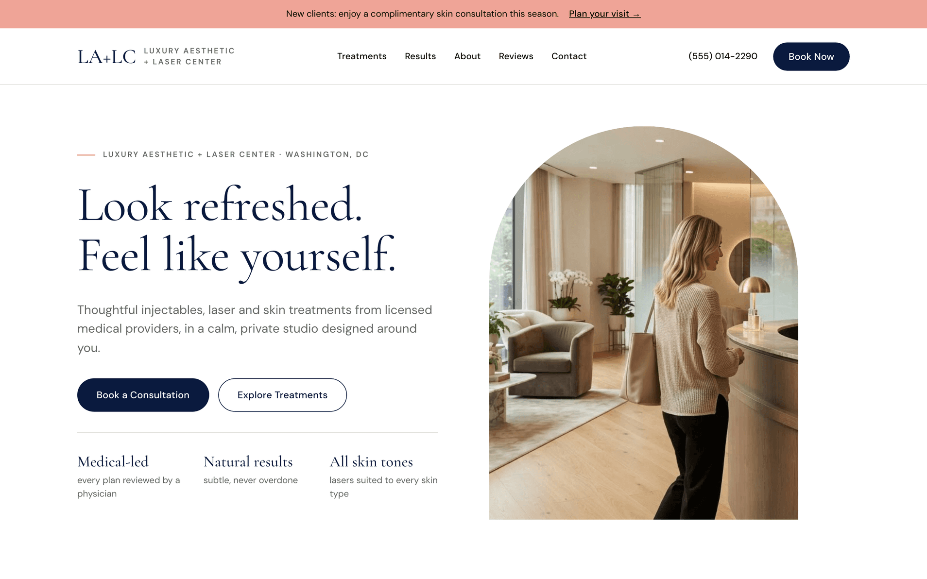
The demo is a med spa homepage that does the first five minutes of a consultation. A visitor can quickly get a feel for the team, the services, the reviews and the office, then book a consultation when they’re ready, without hunting for a phone number.
Every section was designed twice: once as the owner, asking what I want to present to customers, and once as the customer, asking what I want out of the site and what I’m searching for.

Fig. 04
Results — before-and-afters framed around the outcome patients want: refreshed, never overdone.

Fig. 05
Reviews — patient stories in their own words, close to the booking decision.

Fig. 06
Booking — one calm closing call to action, with every way to reach the practice in one place.
06 — Outcome
First client, outside the niche.
WoodWater Bolt, a luxury general contractor in Washington, DC, came to Sena through the new approach and became the studio’s first client. They’re not a med spa, which was its own lesson: the owner-and-customer thinking carries across categories.
Their redesign is in progress. I’ll add the evaluation findings and the before-and-after here when the new site launches.
07 — Reflection
Designing the service, not just the screens.
The biggest lesson wasn’t about layouts. It was that the pitch is a product too, and it deserves the same scrutiny: watch what people actually do with it, then redesign it around that behavior.
Next, I’ll publish the WoodWater Bolt case once it launches, and build a second demo for a non-medical category so the approach isn’t tied to one niche.
